Encourage the whole school Performance appraisal
Break down your analysis with data that reflects your school's X-ray. Increase visibility and facilitate your decision-making with the data most relevant to your school. Establish the most relevant school indicators with ACV to speed up determinations. Strengthen consciousness!
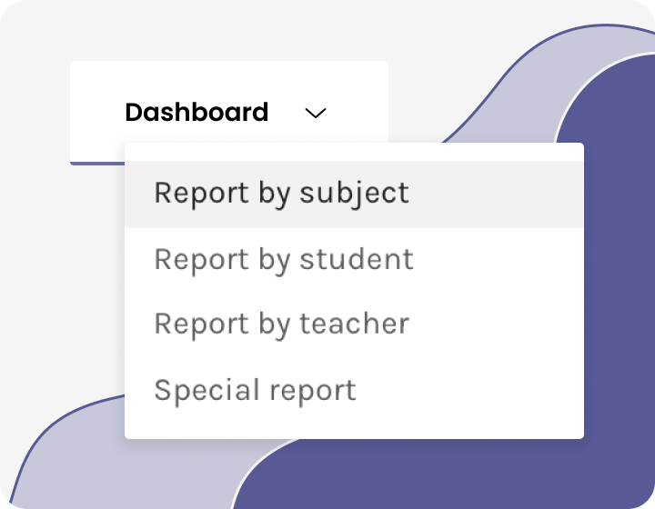
Reports by
Encourage the whole school Performance appraisal
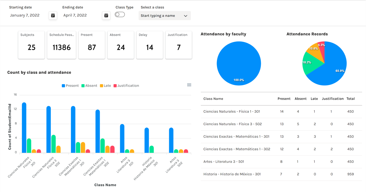
Most Important Metrics
Structured to reflect relevant and timely information. Identify trends, patterns, and outliers within large data sets.
Multiple panels. Each dashboard communicates the most important information about teachers, students, and subjects on a simple, easy-to-understand screen.
Accelerate time-based analysis
Show trends and changes in data over time.
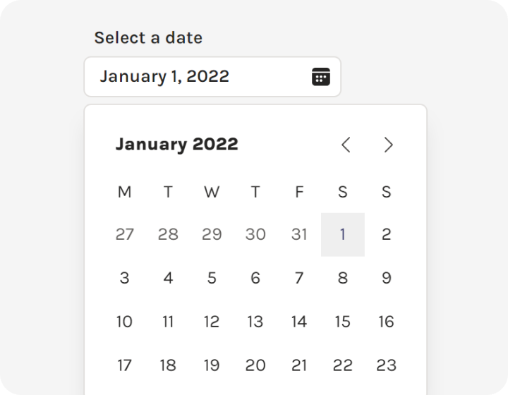
Date picker. Select Date Range. Information in seconds.
Quick scan. Show your school's setting
Offer a broader, more complete perspective from holistic, customized reports.
Hybrid driving. Gather data and charts from virtual, traditional, or hybrid scenarios.

Compare a variety of data simultaneously. Create a focused and effective perspective.
Apply different data insights to a single dashboard. It allows you to choose different data views.
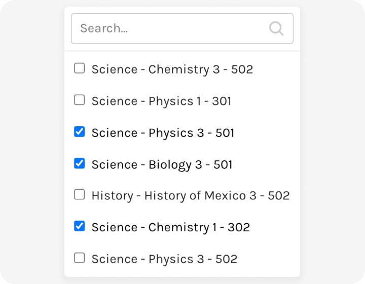
Traditional and Custom Filters. A key part that narrows down the results to provide answers in an organized and structured way.
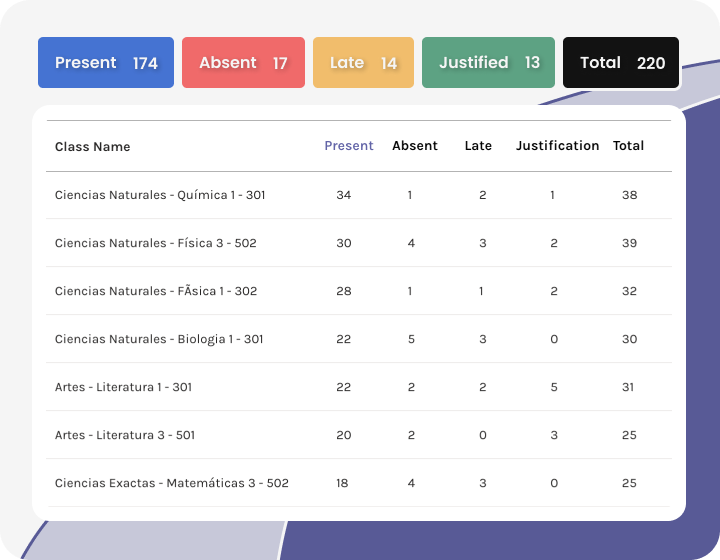
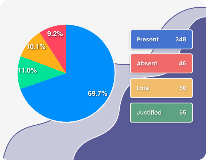
School Snapshot
Identify low points and highlights. See opportunities to optimize.
Summary panel. Handy counter with the main metrics at the top of the screen.
Get your data moving. Agility for decision-makers
The latest data with a living link to your sources. It makes data more natural for the human mind to comprehend. It makes it easier to identify trends, patterns, and outliers within large data sets.
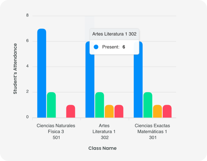
Pivot charts and tables. Visual context through maps or charts.
Smart On-the-Go Panels
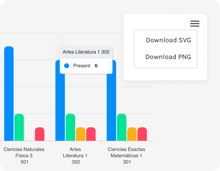
Get quick access to your data. Useful for displaying school information in a slideshow, email, or document.
Fast export. Easily transfer your report to an SVG, PNG, and CSV file.
Strategic Alignment and Engagement
Map your school-specific behaviors on the dashboard, where they can come to life in innovative ways. Easily brainstorm, research, and map your scenarios on this easy-to-use visual dashboard.
Special reports. Define your custom fields, never lose sight of points of interest. Align your team members around the main points that will truly impact your school when you build visual and interactive dashboards.
Structured to reflect relevant and timely information. Identify trends, patterns, and outliers within large data sets.
Multiple panels. Each dashboard communicates the most important information about teachers, students, and subjects on a simple, easy-to-understand screen.
Show trends and changes in data over time.
Date picker. Select Date Range. Information in seconds.
Offer a broader, more complete perspective from holistic, customized reports.
Hybrid driving. Gather data and charts from virtual, traditional, or hybrid scenarios.
Apply different data insights to a single dashboard. It allows you to choose different data views.
Traditional and Custom Filters. A key part that narrows down the results to provide answers in an organized and structured way.
Identify low points and highlights. See opportunities to optimize.
Summary panel. Handy counter with the main metrics at the top of the screen.
The latest data with a living link to your sources. It makes data more natural for the human mind to comprehend. It makes it easier to identify trends, patterns, and outliers within large data sets.
Pivot charts and tables. Visual context through maps or charts.
Get quick access to your data. Useful for displaying school information in a slideshow, email, or document.
Fast export. Easily transfer your report to an SVG, PNG, and CSV file.
Map your school-specific behaviors on the dashboard, where they can come to life in innovative ways. Easily brainstorm, research, and map your scenarios on this easy-to-use visual dashboard.
Special reports. Define your custom fields, never lose sight of points of interest. Align your team members around the main points that will truly impact your school when you build visual and interactive dashboards.